Page 16 is now up for people following this comic. For my blog/journal/personal musing for this week I thought I would shed some light on an artist who is one of the biggest, if not the biggest, influences on the look of this comic, and that would be colorist John Higgins.
If I took a look at my art life as a whole, I would actually consider myself pretty new to using color. I didn't start taking painting, or in that case coloring my art seriously until I was 22 years old. So when I decided to make a comic, I didn't want to take a big risk in the way that I colored it since I was still relatively inexperienced. I already knew that I wanted to go for an old school look, but visual ascetic wasn't good enough. I needed a classical looking colorist who's colors told the story well. Once I looked back at my copies of Watchmen and The Killing Joke, I found the guy who checks all the boxes of what makes a great colorist.
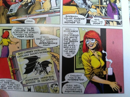
John Higgins isn't simply a guy who puts colors on an image to make it look a little prettier, he's a storyteller in his own right. There was nothing workmanlike about his colors, it looked like every color on the page was a calculated creative decision either of his own volition or in collaboration with his other creators. For example here's the end of one of the pages of The Killing Joke (Took this photo myself so sorry for the shoddiness).
Here is the top of the next page:
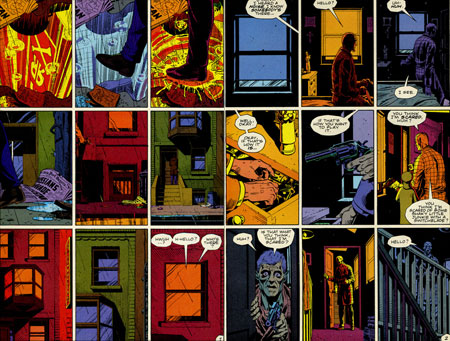
Look at how the switch to a red color palette gives the scene a sense of dread. I could list several examples of his coloring creating mood but I need to finish updating the page. In short this the power that comics have, using simple means to extrapolate emotions from the reader. John Higgins got this, and hopefully I will too over time.
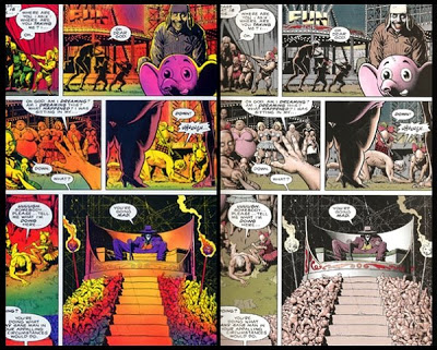
And no, I will not discuss the inferior re-coloring of The Killing Joke. Just see for yourself (re-colored version on the right):
And no, I will not discuss the inferior re-coloring of The Killing Joke. Just see for yourself (re-colored version on the right):
Thank you for reading,
-TiMBo
-TiMBo




 RSS Feed